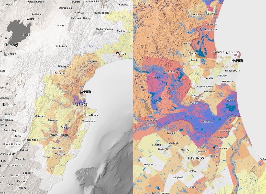
This combined view of wellbeing data and the impacts of a severe weather event is a first for Aotearoa New Zealand.
Description of the tool
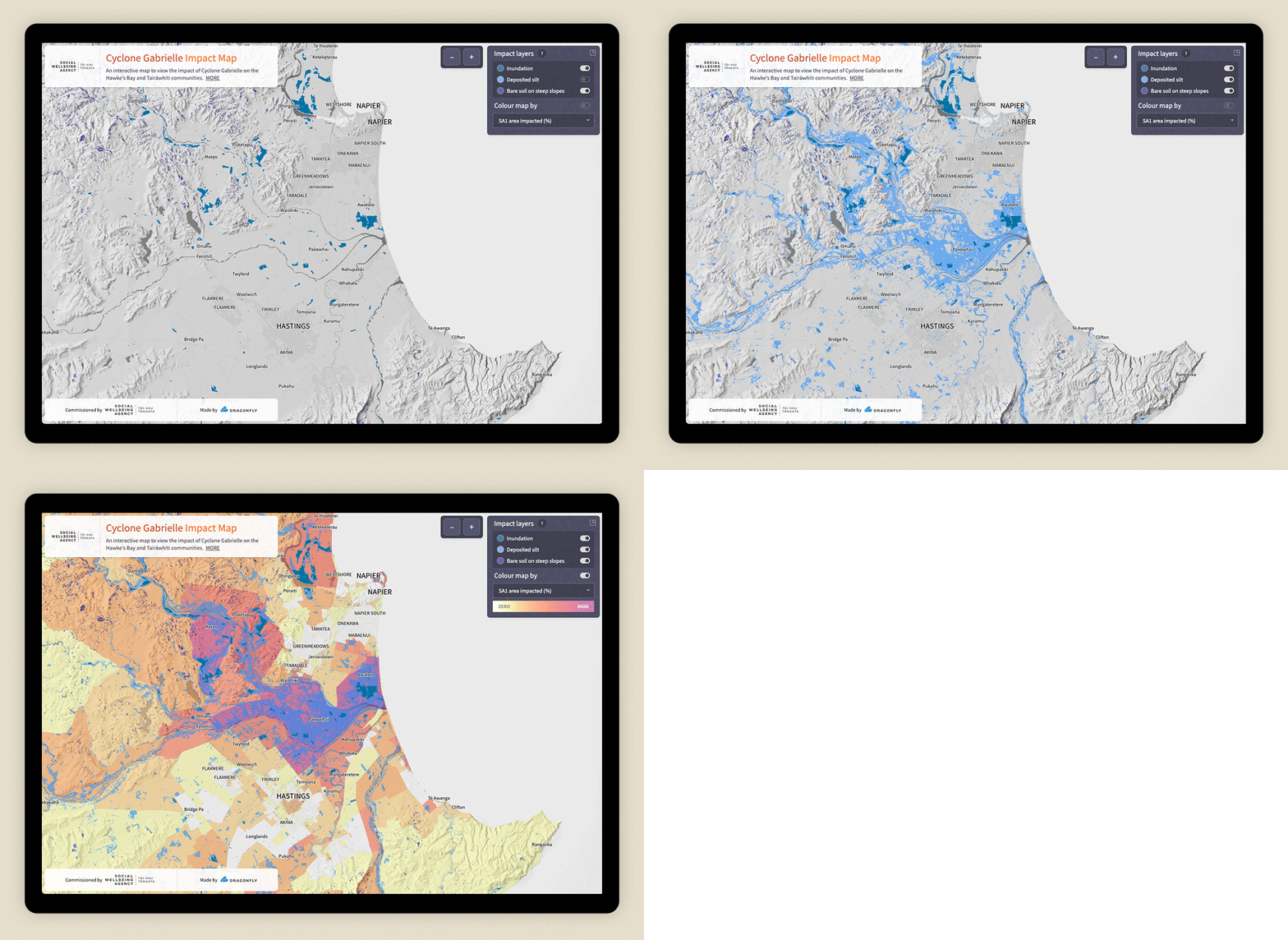
The online tool uses a series of layers to visualise inundated areas, deposited silt and slips. It also displays demographic and social data at a suburb scale.
The areas are coloured according to the impact of the cyclone on particular features, which can be selected in the tool. These include the percentage of area impacted, and the length of roads, farmed area impacted, and buildings, schools, hospitals and supermarkets within an impacted area. Another layer displays the deprivation index (2018).

About the cyclone and its effects
Cyclone Gabrielle was a severe tropical cyclone that devastated the North Island of New Zealand from 12 to 15 February 2023. Its effects were widespread, but particularly intense in the Hawke’s Bay and Tairāwhiti regions, with large areas of flooding and damage to roads and other infrastructure.
Gabrielle was the Southern Hemisphere’s costliest tropical cyclone on record, and the country’s deadliest cyclone and weather event since Cyclone Giselle (the Wahine storm) in 1968.
Satellite data sources and analysis
We used freely available data from two different satellites to map the physical impacts of the cyclone. A snapshot of the flooding was captured using synthetic aperture radar (SAR) data from the Sentinel-1 satellite at 8.07pm on 14 February. This was when the satellite happened to be overhead, but more flooding occurred later that evening.
Data from the Sentinel-2 satellite acquired between 19 and 21 February was used to show the extent of silt and slips, when compared with images taken before the cyclone. The comparison was made using the normalised difference vegetation index, which picks up changes in vegetation, soil and water, such as new silt, slips and inundated areas.
We used the built-in analysis features of Google Earth Engine to identify changes, which reduced the time required for image processing significantly. Areas of cloud were removed using a mosaicking process. Sentinel-1 data was analysed for inundation based on methods recommended by UN-SPIDER. Demographic data was provided by the Social Wellbeing Agency.

Making the maps
The maps were created using QGIS, with our recently developed method that exports a web-ready map with the specified features and zoom rules as a Cloud Optimized GeoTIFF.
Designing for users
Initially, the tool was intended for decision-makers but the client quickly realised how valuable it would be to local affected communities. This public audience was therefore reflected in the design.
A particular design challenge was colouring and shading the map so each different layer could be clearly distinguished by all users.
The final design was informed by testing a prototype with potential users who had a wide range of digital literacy. The Social Wellbeing Agency is now seeking further feedback after launching the online tool as part of their new data explorer.
Ready for next time
New Zealand’s active landscape and the effects of climate change are projected to cause more intense weather events in the future. Satellite data offers an ‘eye in the sky’ view of the impacts on communities that may be cut off, and could be invaluable for assessing the scale of a natural disaster.
This project included development work to make the mapping of satellite images much smoother and more repeatable. This will speed up the production of impact maps after future severe weather events and natural disasters. Having information available in the hours – rather than weeks – after these events will support efforts to reach communities in need as quickly as possible.
Project team
Kusal Ekanayake, Emma Hopkinson, Richard Mansfield, Ian Reese, Yvan Richard, Sadhvi Selvaraj, Simon Winter, Pep Zuijderwijk.
Top image: Silt-inundated apple orchard in Esk Valley, north of Napier. Sarah Wilcox.
The visualisation of physical and social data together is the really exciting aspect. We’re not aware of that having been done previously.
At the start we talked a lot about our shared values and that really informed the partnership and how we worked together.
We acknowledged early on that our skills were complementary and we quickly fell into a rhythm of working independently but coming together regularly to share ideas.
The timeframe was very tight and both organisations were able to respond rapidly to demands from decision-makers.
Aphra Green
Deputy Chief Executive, Policy, Data and Insights
Social Wellbeing Agency .

