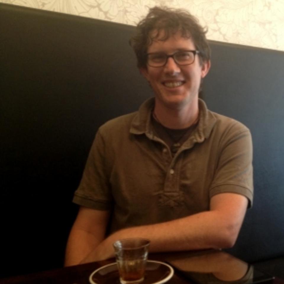
Christopher Knox recently joined the Dragonfly team as a visualisation scientist. Originally from Christchurch, he spent 10 years overseas, most recently in Saudi Arabia.
Although Chris and his wife were planning to return to New Zealand eventually, the offer of a job with Dragonfly was the catalyst they needed to make the move home.
“I was working in data visualisation at the King Abdullah University of Science and Technology. It’s an international university carrying out research in areas like solar power, desalination and drought resistant plants, as well as other traditional science disciplines”, he says.
“The brand new university was built in 2009 and is set on a 32 sq km campus, where nearly everyone lives.
Data visualisation was used by teams across the university as a tool to cope with terabyte-sized data sets, as well as by chemists working on large biomolecules or catalytic clusters.
“Visualisation is a two stage process that begins by using an algorithm to reconstruct a 3D representation of your data, whatever its original form was. This is done routinely for MRI scan data where ‘slices’ of the body are put together again to make the body shape in three dimensions. The second stage uses a technique like ray casting to draw or transfer the shape onto a screen. By virtually shining rays through the shape and seeing what makes it through, you can map what’s inside, based on the density or another property of the material. You repeat the ray casting over and over in different fields and use colour to show up different values.
“If you were visualising a brain you could use different densities to map the skull, tissue and blood vessels, and quickly zoom in to the areas you were particularly interested in, such as a tumour. That’s the beauty of visualisation – you can get to what you want quickly, without having to wade through all your data.
But visualisation also has a downside. “The great strength and weakness of visualisation is that it looks awesome! That can make it very easy to show people the wrong result – and when it’s up there in colour it becomes very believable.”
Chris also has a long-standing interest in using visualisation for field science. One of his goals is to help field scientists make better decisions in the field about what they are sampling, using visualisation and analysis.
“While I was in Saudi I was involved in starting a company that produces the iDive, a waterproof housing for iPads so they can be used when scuba diving. The project came out of work we were doing with marine biologists, who were looking for a better way to do things. Using the iPad they can put the data straight in while they’re underwater instead of scratching on pieces of waterproof paper.”


